Awards
This is a small selection of Awards emails I have put together, simply by using the campaign creative.
The Broadcast Awards' website had this groovy top detail of the CMYK Press Bar dripping down, so I continued this down the page and met it up with a repeat image at the base. On the black background this email is particularly striking. The PDF unfortunately prevents
you from seeing the animation of the
"Enter Now" detail at the top.
The Lighting Design Awards email again used the creative to top-and-tail the design, as well as providing a vibrant colour scheme. This was then mimicked inside to create a housing box for the sponsor logos.
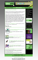
The Glee Awards email has been split into two bubble sections, one for the title and one for the content. This is just a different way of laying out the email, and doesn't work with all creative. The Glee Awards Logo was very simple and so I developed an exciting header that sat better away from the text. However it is all tied together nicely with matching borders around the sections.
Welcome to Gini Gill Creates...
Well, this is my first online experience... it's quite fun so far!
I've created this space for showcasing the best of my backlog of HTML emails. I also design buttons and banners and do a small amount of freelance on the side so feel free to get in touch.
With my work I like to keep everything clean and tidy, with no reams of unnecessary coding.
Click on any image to see the full size version.
Wednesday 10 September 2008
General "Inform" Emails
Here are some of my favourite email templates to date.
The Drapers email is fairly simple and therefore very aesthetically pleasing. The layout reflects the magazine's cover and the colour scheme was taken from the creative. The email is made up of a series of images as backgrounds, and then tables are used to position the text
away from the edges. I personally have
found this the easiest way to put
together this type of design.
The shots email is very busy, yet is exactly what they like. The magazine contents page itself is a confusing collage of images and words, so in comparison this email is fairly tame. The header is put together from sections of the magazine cover, with the magazine spine used to detail the date and issue number.
The Retail Jeweller email is another simplistic style, but with soft gradients to create a sophisticated look. This magazine has very little campaign branding, and therefore it's always safest to pick out a feature - in this case the wallpaper - and keep all the other details very low key. The look and feel is very much aimed at the target audience of Jewellery Retailers.
Two More Simple Designs
I wanted to example some other designs techniques I have created, for simplistic "inform" emails.
This Broadcast email is not very exciting, but I wanted to example the use of Branded Backgrounds. It works well in two-tone, and does not detract
from the email content but instead helps
it stand out.
The second is very colourful, to emanate the theme of Children's Education and uses lots of the campaign branding to make it more interesting aesthetically. The content alone would be very dull, however the colours and layout make it more appealing to read.
Newsletters
During my time at emap I developed a template for "Newsletters".
The layout is pretty standard, with a Branded Header, Information Panel and Side Buttons Panel. This can then be manipulated however is seen fit to incorporate all the information.
These are 2 examples where the layout
is identical and yet the colour scheme
and content has created
2 completely different feels. This design was based on functionality; Show the reader where the stories are, but give them immediate access to the main links (i.e. the buttons).
In the Pure Newsletter I also included a drop down menu which contained all the email addresses of the exhibition team. These could be then be selected to bring you up with a prepopulated email. It was a nice touch.
Misc.
These are just some examples of slightly different emails that I have created. The "Postcard" style works very well as an e-shot, with a more fun-feel than a standard subs email.
The "Poker Time" was me experimenting
with layout and tables, to create a very different style of email. I found that branding which has such strong, recognisable colours and shapes will stand out and do half the work for you. All you'll need to do then is come up with an offer to win over the other half.
Subscribe to:
Posts (Atom)